Eight Warning Signals are Flashing Red
Markets are hitting record highs, but multiple independent indicators such as extreme valuations, collapsing market breadth, record cash hoarding by Warren Buffett, and crisis-level central bank easing are simultaneously flashing red. Together, these eight warning signals suggest the current risk/reward profile has shifted materially.
“History never repeats itself, but it does often rhyme”
Markets are exhibiting the rarest combination of warning signals since 1999: elevated valuations, internal deterioration, and defensive positioning by smart money, all occurring simultaneously while central banks panic.
The Trend is Your Friend….Until it Isn’t
One hundred dollars invested in the S&P 500 at the beginning of 1925 would be worth approximately $2,348,639 today, assuming reinvested dividends. That's a compound annual return of 10.52%, or 7.36% after inflation - a testament to the extraordinary wealth-generating power of American equity markets.
Chart 1: S&P 500 - 100 Years of Trend Channel Discipline
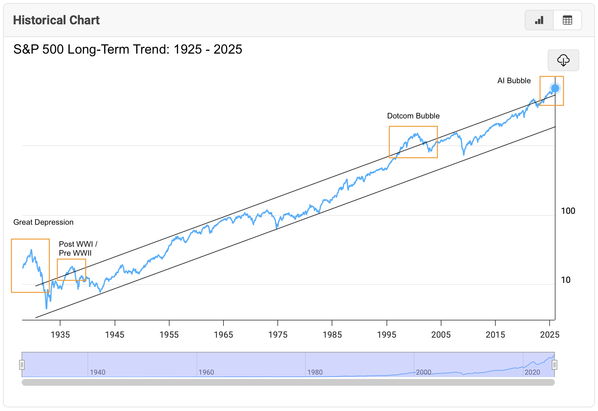
For a century, the S&P 500 has maintained remarkable trend-channel discipline, delivering consistent returns with clockwork efficiency. The index has rarely broken significantly above (never below) this channel: during the Great Depression and for a short interval between the World Wars, the dot-com bubble, and now.
The last exception should give investors pause. While the S&P 500 continues its march to record highs, troubling patterns are emerging beneath the surface. Eight distinct warning signals, ranging from a rarely-triggered technical indicator to unprecedented cash hoarding by Warren Buffett, are converging in ways that have historically preceded major market dislocations.
The Hindenburg Omen: History Rhyming Again
Chart 2: Hindenburg Omen - Historical Triggers and Subsequent Returns

Source: StockCharts
The technical alarm that correctly signalled both the 1987 crash and the 2008 financial crisis has been triggered again. On October 29, 2025, the Hindenburg Omen flashed red, identifying a dangerous combination: new market highs, elevated new lows, and deteriorating market breadth occurring simultaneously.
The historical data is sobering. Across 30 previous occurrences, markets averaged losses of 6.38% two months later and 6.28% three months later. More critically, the indicator reveals what headline indices conceal: while the S&P 500 makes new highs, an increasing number of individual stocks are breaking down. This internal fragmentation typically precedes broader market weakness by several weeks to months.
“The Hindenburg Omen doesn't predict crashes; it identifies periods when the market's internal structure becomes unstable,” explains one market strategist. “It's like detecting cracks in a building's foundation while everyone focuses on the penthouse party.”
Smart Money Steps Aside
Chart 3: Berkshire Hathaway Cash Holdings - $348B and rising
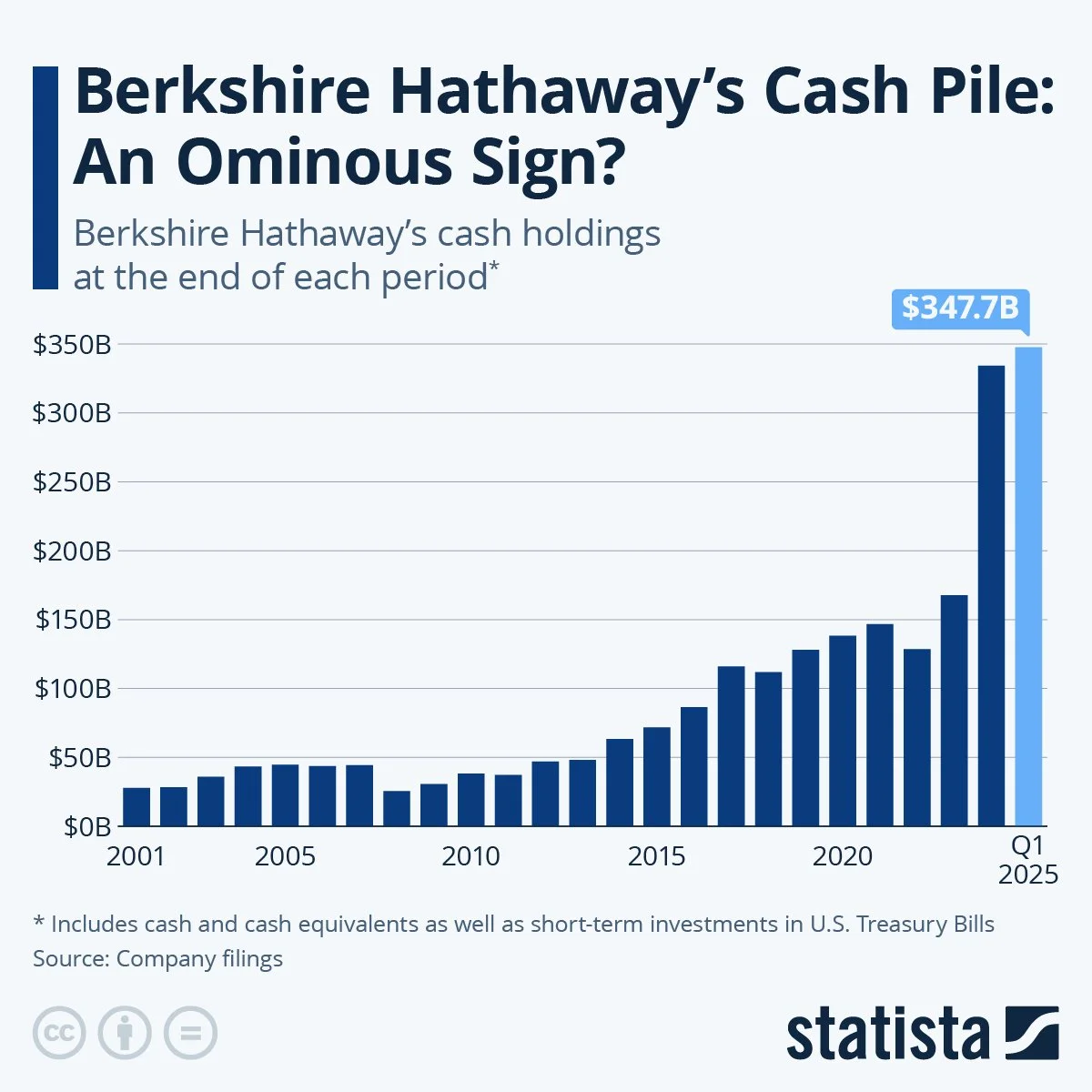
Source: Statista
Recently, both Howard Marks and Warren Buffett have signalled their challenges finding value in the current market environment. Buffett, the “Oracle of Omaha,” has accumulated $348 billion in cash - the highest level in Berkshire Hathaway's history and more than double the company's previous record.
Buffett has been a net seller of stocks for 12 consecutive quarters. His cash position now represents a historic 29-year high as a percentage of Berkshire's total assets. This isn’t so much portfolio rebalancing as it is repositioning for what lies ahead.
Buffett has famously advised investors to “be fearful when others are greedy.” His actions suggest he's taking his own advice. The question for other investors: what does Buffett see that the market doesn't?
The Valuation Extreme
Chart 4: Buffett Indicator - Stock Market Cap to GDP at 217%
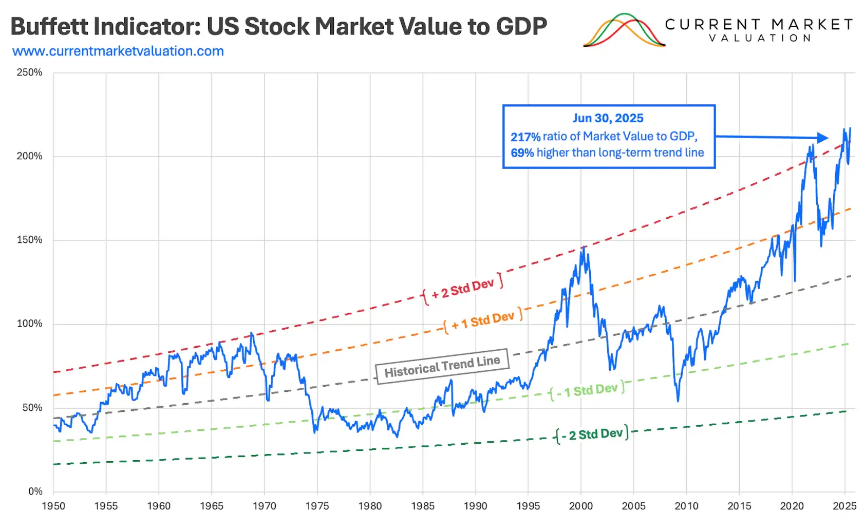
Source: Current Market Valuation
Speaking of Buffett, his preferred market valuation metric tells an equally concerning story. Total US stock market capitalisation relative to GDP currently stands at 217% - sitting 69% above its historical trend line and exceeding prior peaks during both the dot-com bubble and the 2021 post-COVID speculative frenzy.
While this metric doesn't guarantee an immediate correction, it dramatically increases the market's vulnerability to any negative catalyst. As standard deviation bands show, current valuations are in territory typically followed by significant mean reversion.
Multiple Valuation Metrics Flash Red
Chart 5: Shiller P/E Ratio - Approaching Danger Zone
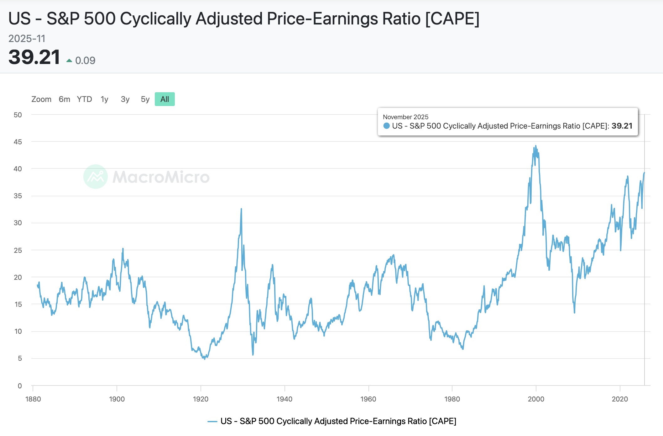
Source: MacroMicro
The Shiller P/E ratio, which smooths earnings across 10-year economic cycles to filter out noise, currently stands at 40x, nearly triple its historical 15-17x average. Only the dot-com peak of 44x has exceeded today's level.
Chart 6: Dividend Yields at 21st Century Low
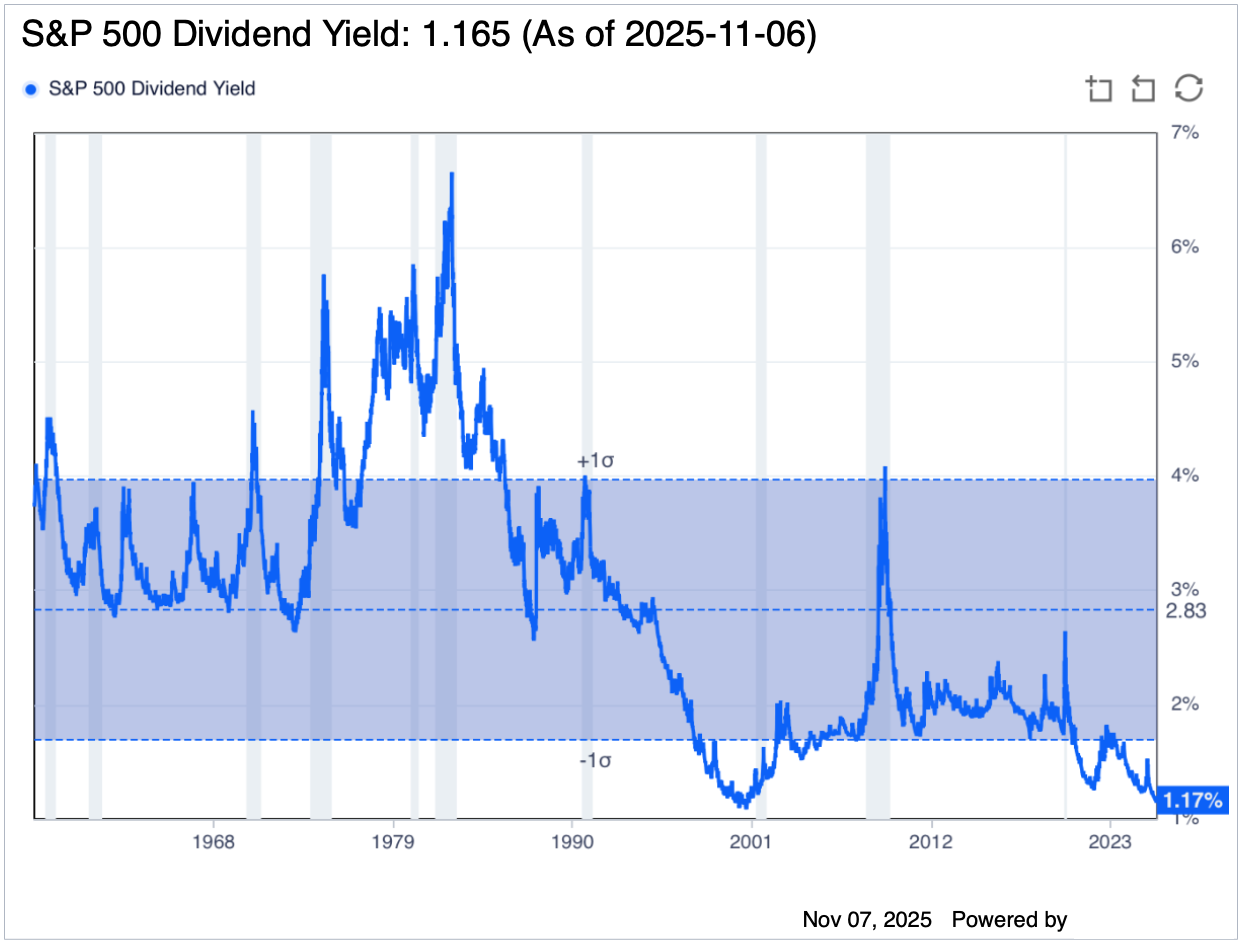
Source: Guru Focus
The S&P 500 dividend yield has dropped below 1.3% - a threshold crossed only twice before: in 1999 preceding the dot-com collapse, and in 1929 before the Great Depression.
Chart 7: Nasdaq price-to-sales ratio overextended
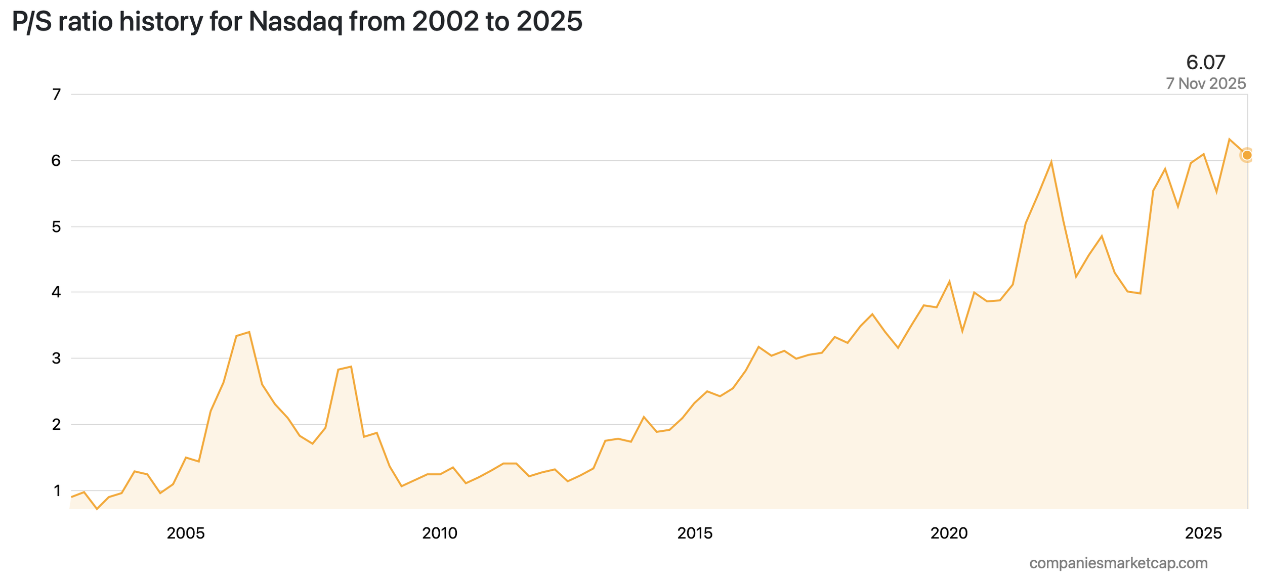
Source: Companies Market Cap
The Nasdaq price-to-sales ratio, which compares market capitalisation to revenues, shows extreme optimism in future earnings growth - levels previously seen only during the dot-com bubble.
Four Valuation Metrics, One Message
• Buffett Indicator: 217% (vs 147% average)
• Shiller P/E: 40x (vs 15-17x average)
• Dividend Yield: <1.3% (1929, 1999 levels)
• Nasdaq P/S: Extreme (dot-com levels)
When multiple independent valuation metrics simultaneously flash red, mean reversion becomes a question of when, not if.
The Economy Nobody Feels
Chart 8: Consumer Sentiment vs. S&P 500 - The Great Divergence
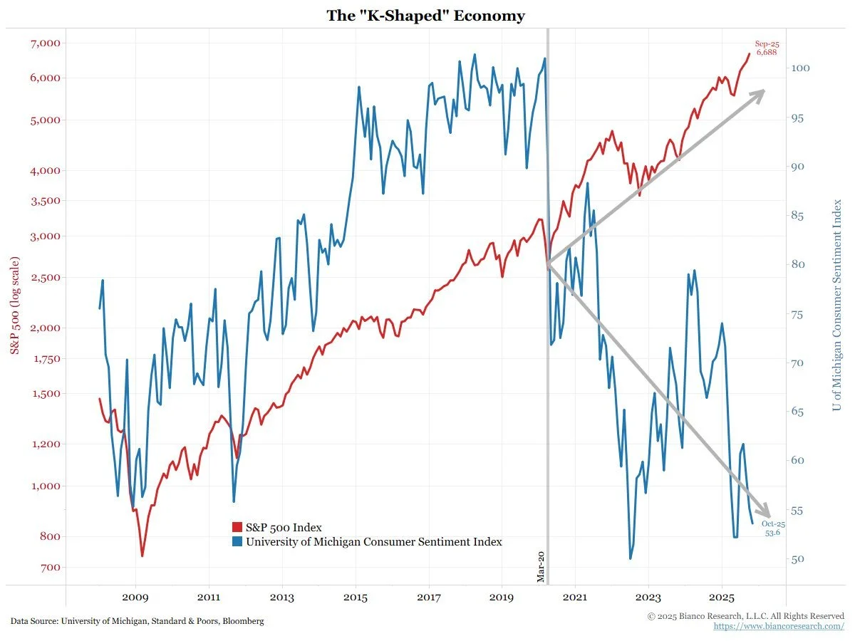
Source: Jim Bianco
The S&P 500 sits near 6,700 while the University of Michigan Consumer Sentiment Index registered 52.2 in May - one of its lowest readings ever recorded. The chart paints a stark picture: one cohort growing wealth on paper through asset price appreciation, another struggling with the rising cost of living.
Chart 9: Magnificent 7 vs. Equal-Weight Nasdaq - Internal Divergence
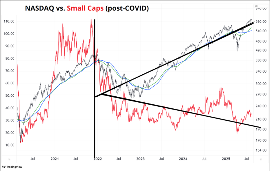
Source: Spectra Markets
The market's internal divergence is equally striking. The Magnificent 7 have soared while the equal-weighted Nasdaq has barely moved, making the remaining companies look like a rounding error. This K-shaped pattern began after the 2021 COVID peak and has intensified as tech giants have committed vast sums of capital to AI infrastructure buildouts.
Chart 10: S&P 500 vs. Job Openings
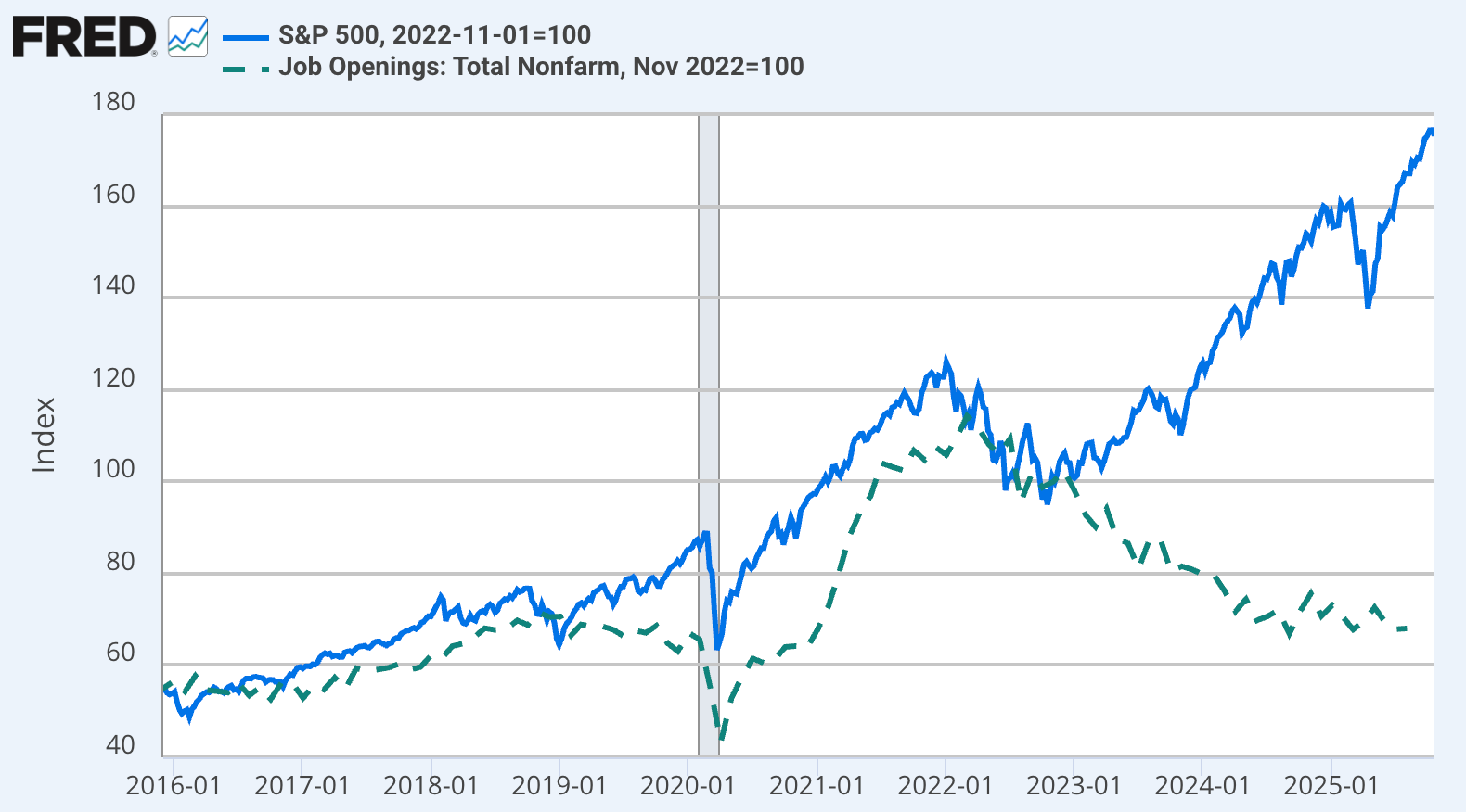
Source: Derek Thompson
A third K-shaped divergence emerged in labour markets in late 2022. This has been touted as coinciding with a significant ChatGPT model, but may align more closely with an interest rate hike from the Federal Reserve. While the S&P soared, job openings collapsed. Whether or not this can be solely attributed to AI, the productivity boost AI promises comes with a dark implication: the acceleration of job displacement and lower demand for entry-level positions.
Chart 11: Economic Participation Collapses

Only 20% of the US population currently experiences economic expansion, down from near-universal participation in prior cycles. This isn't just a social issue. It's an economic time bomb waiting to happen. Consumption-driven economies require broad-based prosperity. Concentration of gains in financial assets has its own limits.
Crisis-Level Policy for Record Level Markets?
Chart 12: Global Central Bank Rate Cuts - 312 Cuts in 24 Months
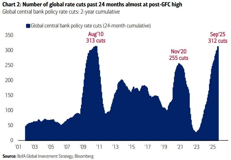
If the economy is healthy enough to support record stock valuations, why have global central banks implemented 312 interest rate cuts over the past two years - levels previously seen only during the 2008 Global Financial Crisis?
The spike in coordinated rate cuts, having surpassed the COVID era, now approaches GFC heights. This reveals an uncomfortable truth: monetary authorities see something requiring crisis-era intervention. Either they're panicking unnecessarily (unlikely given coordinated global action) or they're attempting to front-run deterioration that markets are yet to price in.
The Liquidity Paradox
Chart 13: Federal Reserve Reverse Repo Facility - 97% Collapse
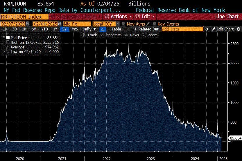
Following the COVID correction, the Federal Reserve's Reverse Repo Facility has collapsed from $2.5 trillion to just $85 billion - a 97% decline in this critical financial system buffer. This facility acts as a liquidity safety valve for markets. Its depletion means a vital cushion has been exhausted.
While bulls interpret this as cash entering markets (bullish), bears see ammunition reserves depleted (vulnerable). Combined with Buffett's record cash position, a pattern emerges: sophisticated investors are prioritising liquidity over returns, which is not typical late-cycle behaviour.
The Safety Trade
Chart 14: Gold - Breaking out above $4,000
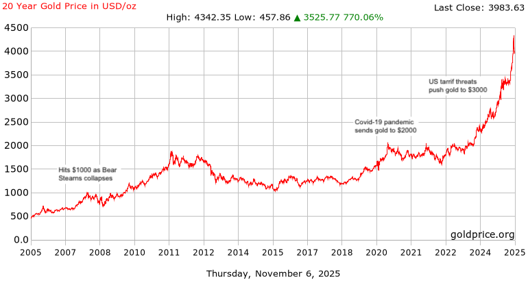
Source: GoldPrice
Gold is behaving like a risk asset. The breakout to all-time highs above $4,000 (reaching $4,346 on October 20, 2025) represents a year-to-date gain exceeding 53%. Gold's surge, driven partly by increased central bank buying, sends a clear message: sophisticated investors are hedging broad based risks.
Historically, simultaneous strength in both equities and safe-haven assets precedes periods of stress. Investors want exposure but also value protection.
Chart 15: Central Banks Shift from Treasuries to Gold
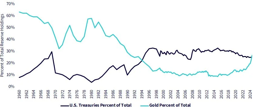
Source: Seeking Alpha
Beginning in 2024, central bank demand for gold reserves and dollar-hedging assets has surged, threatening Treasury dominance for the first time since the Bretton Woods collapse. When monetary authorities trust metal over each other's government bonds, that's not late-cycle positioning, it's early-stage defensive positioning.
Market Breadth: The Hidden Weakness
Chart 16: S&P 500 - The Melt-Up Phase
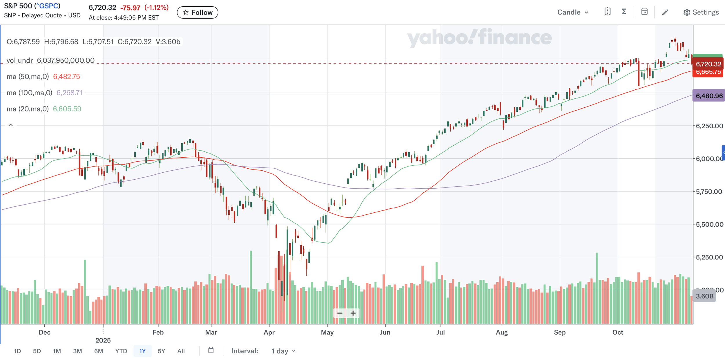
Source: Yahoo
Technically, the S&P 500 appears healthy, trading well above all major moving averages in what analysts call a “melt-up” phase. But this surface strength deceives.
Chart 17: McClellan Oscillator - Deteriorating Participation
Momentum indicators reveal otherwise. The McClellan Oscillator, which measures market breadth, shows deteriorating participation. The rally is narrowing, driven by fewer stocks as capital quietly exits. This classic divergence (strong prices masking weak internals) historically precedes corrections.

Source: Stock Charts
The Data We Can't Trust
Chart 18: CPI Data Quality - Estimation Replaces Measurement
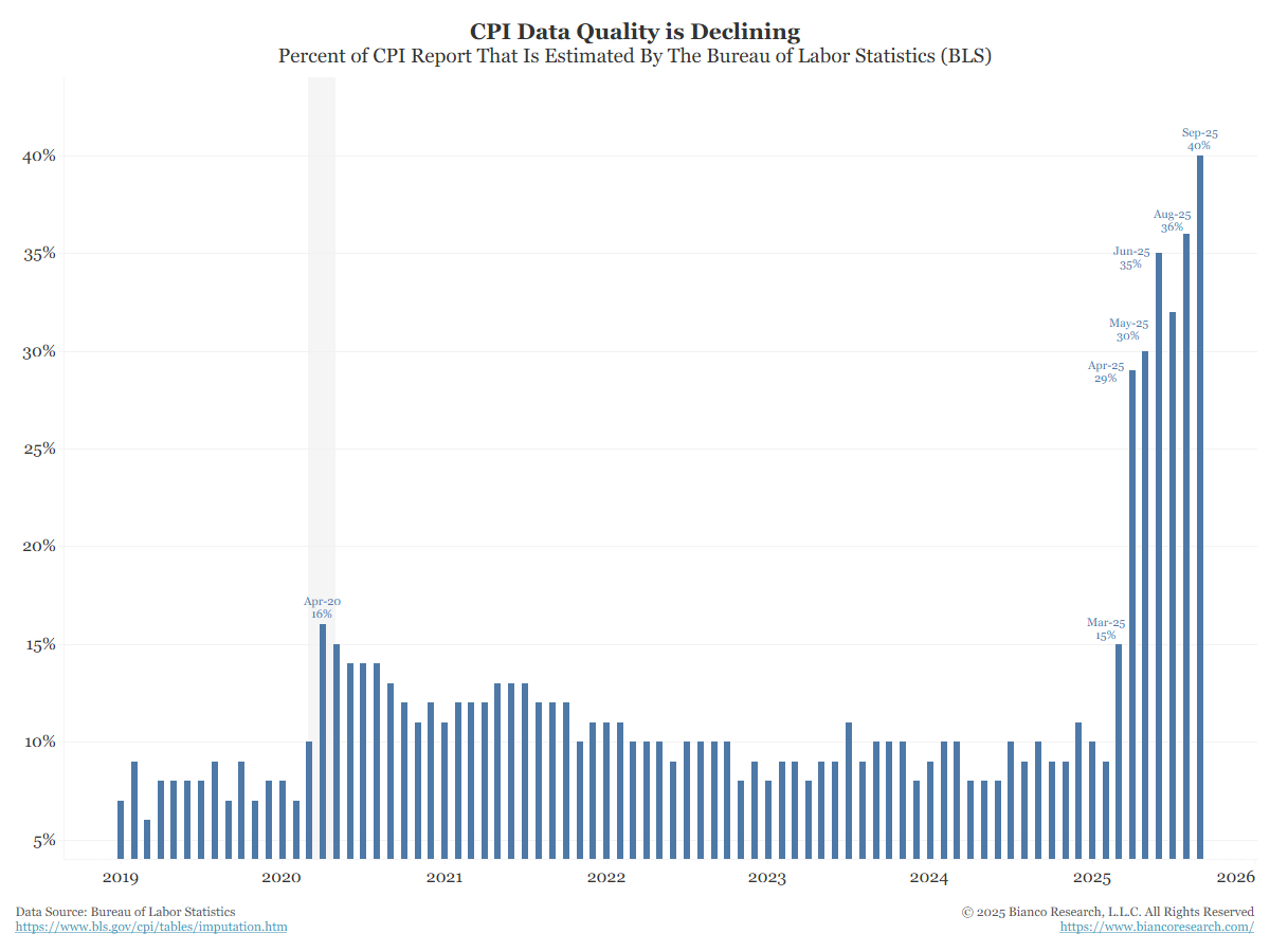
Source: Bianco Research
When markets are priced for perfection but measured with imperfect instruments, the margin for error collapses.
Perhaps the most under-appreciated risk is the quality of economic data itself. The Bureau of Labor Statistics now estimates approximately 40% of the Consumer Price Index, up from 15% historically. As actual data collection becomes more challenging, statistical modelling fills gaps.
This matters profoundly. Inflation metrics drive monetary policy, which drives discount rates, which drive valuations. If inflation is systematically misestimated, in either direction, policy responses will be systematically inappropriate. Markets priced for perfection assume confidence in institutions and processes. Markets navigated with increasingly imprecise instruments risk a false sense of security.
What Could Still Go Right
Before positioning defensively, it's worth acknowledging powerful countervailing forces that could extend this bull market:
Productivity revolution: If AI delivers the productivity gains proponents promise, elevated valuations could prove justified. The infrastructure buildout by the Magnificent 7 represents unprecedented capital investment that could unlock genuine economic transformation.
Central bank support: Global monetary easing provides powerful tailwinds. History shows central banks can extend rallies far beyond what fundamentals suggest - sometimes for years.
Earnings resilience: Corporate profits have proven remarkably resilient despite economic headwinds. Margins remain elevated, and many companies continue generating robust free cash flow.
Technical momentum: Trends persist longer than rational analysis suggests. The S&P 500 remains well above all major moving averages, and momentum stays firmly positive.
False signals: The Hindenburg Omen generates false positives 20-40% of the time. Many who positioned defensively in recent years significantly underperformed.
These aren't trivial counterarguments - they represent real possibilities. Market timing is notoriously difficult, and staying invested through volatility has historically produced better outcomes than attempting to trade around corrections.
The Balanced Approach
Rather than predicting an imminent crash, the convergence of these eight signals suggests a recalibration of risk management is prudent:
Recognize that the risk/reward ratio has shifted unfavourably
Reduce concentration in the most expensive, momentum-driven positions
Increase portfolio quality by favouring companies with strong balance sheets and genuine cash flows
Maintain hedges through options, inverse positions, or alternative assets
Hold higher cash levels than typical for this stage of a cycle
The goal isn't market timing. Rather, it's positioning for a wider range of outcomes than the market currently prices.
The Bottom Line
No single indicator reliably predicts inflection points. But when eight distinct warning signals align - a triggered Hindenburg Omen, extreme valuations, economic divergence, crisis-level central bank intervention, liquidity depletion, safe-haven rotation, market breadth deterioration, and data quality degradation - the probability distribution has materially shifted.
The challenge isn't predicting the exact top of the market; it's recognising when the risk/reward ratio has fundamentally shifted. At current valuations, markets continue to price perfection while internal measures suggest growing fragility. That asymmetry defines the moment we're in.
Markets climb a wall of worry and descend a slope of hope. Currently, complacency dominates. The VIX remains subdued. Retail investor cash allocations sit at historic lows. Margin debt is elevated. Everyone appears on the same side of the boat.
When conditions shift, surprises follow.
Whether that surprise arrives in weeks, months, or it proves to be another false alarm is unknowable. What is knowable though: the margin of safety has compressed dramatically, and the cost of being wrong has increased accordingly.
In Warren Buffett's words: “Only when the tide goes out do you discover who's been swimming naked.” With $348 billion in cash, he's clearly put on a wetsuit. The question for other investors is whether they should do the same.
In Part 2 of this series, I'll examine the most under-appreciated risk: the private credit time bomb hiding in plain sight, and why the parallels to 2008 are more concerning than most investors realise.
The author holds positions in gold and maintains higher-than-typical cash allocations. This article is for informational purposes only and does not constitute investment advice.